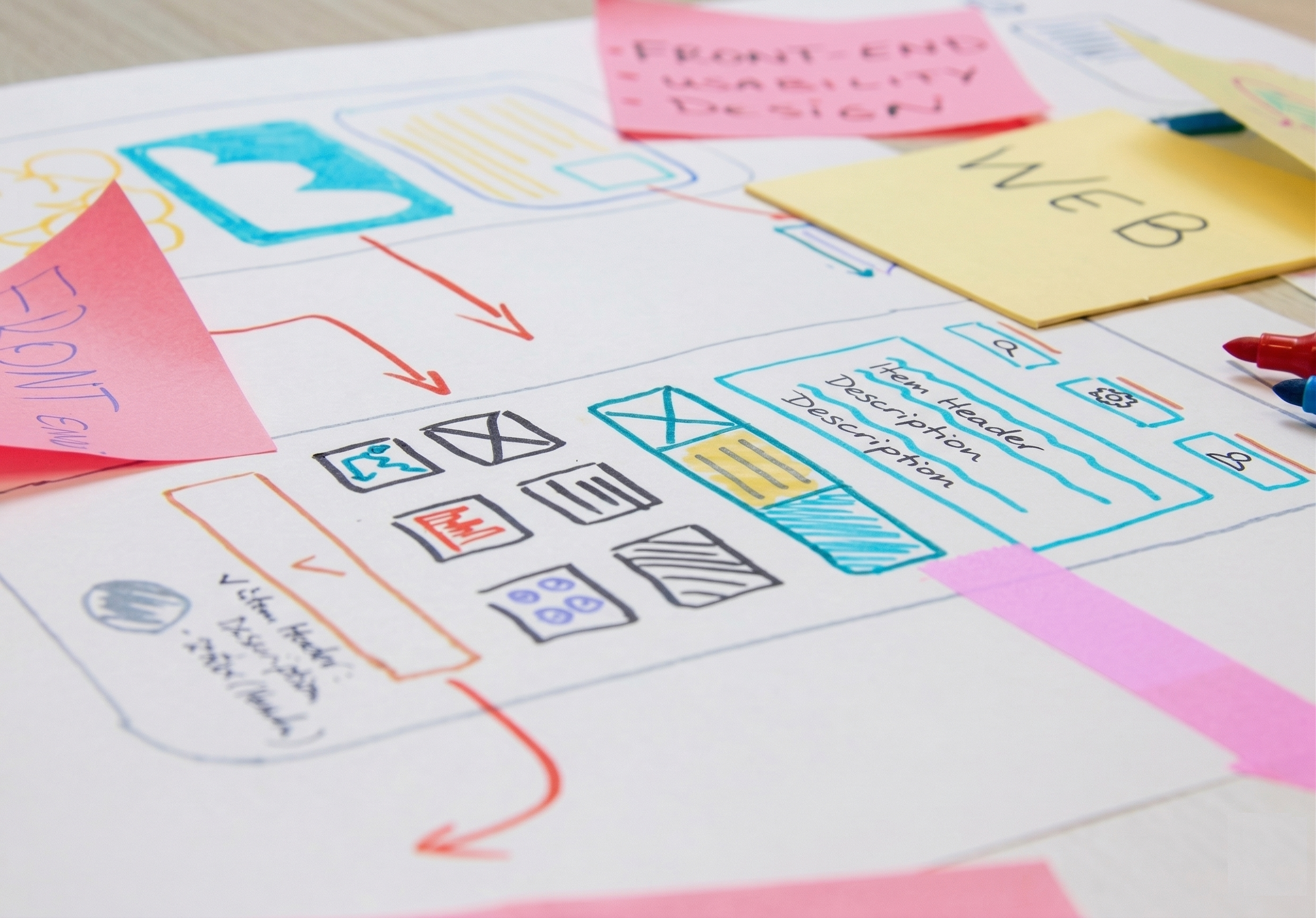
Strategy & structure
We map the page before we design it. Audience, message, flow, and conversion goal come first.
Most landing pages make users think. They hesitate. They leave. We build pages that guide, not confuse. Every element earns its place. Every step leads to the next.
You invest in ads. You pay for every click. Then the page does nothing with it. Here is what kills conversions before they happen.
The user clicked on something specific. The page talks about something else. Trust disappears in seconds.
Too many choices. No clear hierarchy. The user is left to figure out what to do next. They don't.
No story. No build-up. Just a button demanding commitment. Without context, the answer is always no.
The page gives users no middle path. No softer next step for someone who is interested but not ready. It's a hard close on cold traffic. Most people leave.
Conversion-focused UX
A landing page is a guided experience. It answers questions before they are asked. It removes doubt before it forms. It leads. The user simply follows.
Every page we build passes through all seven layers. Each one addresses a specific moment in the user's decision. Miss one, and the page breaks there.
The page confirms what the ad promised. The user recognises themselves immediately.
Logos, credentials, real faces, transparent information. Trust is built visually before it is read.
No cognitive effort. One clear path. The user is guided, not navigated.
Decisions are emotional. We trigger the right feeling at the right moment using consumer psychology.
We address the fear before it becomes a reason to leave. Returns, guarantees, human contact.
Short forms. Simple steps. Respect for the user's time. Loyalty goes to the easiest experience.
Post-conversion reassurance. Confirmation, next steps, and a reason to stay confident.
We map the page before we design it. Audience, message, flow, and conversion goal come first.
Written to move. Every headline, every line of body copy carries the user one step further.
The page continues the conversation the ad started. No disconnect. No lost trust.
Most clicks happen on mobile. We build for that first, then adapt for desktop.
Every conversion tracked correctly from day one. We measure what matters.
Built to be tested. We structure the page so you can iterate and improve over time.
A well-structured landing page can double your conversion rate. That's not a promise. That's what the data shows. Same ad spend. Same traffic. The page does the work.
Tell us what you're running, where users are dropping off, and what you need to happen. We'll take it from there.